Case Study

Electrolux
Data Visualization System

Electrolux read its own operation through disconnected spreadsheets and unstandardized dashboards. I designed a data visualization system in Power BI: three dashboard contexts, reusable templates, and a manual any team could follow without a designer. The board adopted it as the global standard.

NDA-aware case study. This project is covered by a non-disclosure agreement. Visual content has been abstracted. What follows focuses on process, methodology, and outcomes rather than proprietary data or internal screens.

Company

Dojo Smart WaysClient: Electrolux

Role

Data Visualization DesignerPower BI + System Design

Scope

5 WavesLATAM, global rollout

Stack

Power BI, Figma+ Documentation

Ten people could read the same metric and reach ten different numbers. The data was not the problem. The missing part was a shared language for displaying it.

Background

Ten versions of the truth.

The Situation

Electrolux teams each managed reporting their own way: Excel here, Google Sheets there, Power BI dashboards built without a standard. Every team had a version of the truth, and no two versions matched.

Leadership couldn't consolidate a view across regions, and analysts spent their time reformatting instead of analyzing.

Dojo was hired to build dashboards from a centralized Data Lake. The brief: connect the data, make it readable. I saw room for something more permanent.

The Mandate

I delivered the brief across five waves in LATAM, one per business area: Power BI dashboards connected to the Data Lake, giving teams a unified way to read operational and strategic data.

But the brief had a hole. If every dashboard was custom-built, the fragmentation would return the moment Dojo left. Teams would diverge again.

So alongside the dashboards, I built a template system and a documentation manual: a standard any Electrolux team could replicate without a designer in the room. That decision is what made the work outlast the engagement.

The three contexts

Executive, operational, analytical: one visual language.

Not every audience needs the same view. The system was designed around three distinct dashboard contexts, each with a defined purpose, visual hierarchy, and interaction depth.

Executive Dashboard

Goal attainment, regional performance, and strategic KPIs at a glance. Low interaction by design: the first screen answers the key question without drill-down.

Summary view Low density Goal tracking

Operational Dashboard

Daily monitoring for team leads: output by period, process efficiency, and deviation flags that surface problems before they grow.

Time series Deviation alerts Daily cadence

Analytical Dashboard

Deep-dive views for analysts: variance distribution, cross-dimensional breakdowns, trend analysis. Built for exploration, with high interaction depth.

Variance analysis Cross-dimensional High interaction

The key decision

Treating dashboards as a design system.

A style guide would have been the obvious answer, and it would have died in a folder. I approached the standard the way you approach a design system: as components with defined behavior, living in the tools people already work in. One pattern had to serve three destinations at once, or it would only ever be followed by the person who wrote it.

01

Sketch in Figma

Anyone can draft a dashboard in Figma using data visualization components that behave and read exactly like the final result. What you sketch is what ships.

02

Build in Power BI

The same components exist as Power BI visuals following the standard. Building a new dashboard means placing components and connecting them to the Data Lake, not redesigning from zero.

03

Documented globally

Every pattern lives in an official standards document, valid across the company worldwide. The system is not tribal knowledge; it is something a new team can adopt without meeting me.

Layouts as components, not as files

The library covers the layout situations a dashboard actually runs into: a single dominant chart, a KPI band over a detail table, side-by-side comparisons, breakdowns that need three panels of equal weight. Each one encodes the decisions nobody should have to make twice, including grid, header structure, KPI band position, and which slots accept which visualization type.

Choosing a layout became a question about the audience rather than a design exercise. How much detail does this reader need, and how fast? An executive scanning attainment and an analyst hunting a variance get different structures from the same system, so the numbers stay comparable across every screen in the company.

Because the identical structure exists in Figma and in Power BI, a sketch and a shipped dashboard line up without translation. A business analyst can propose a view in the morning and have it built on the standard the same day, without a designer in between.
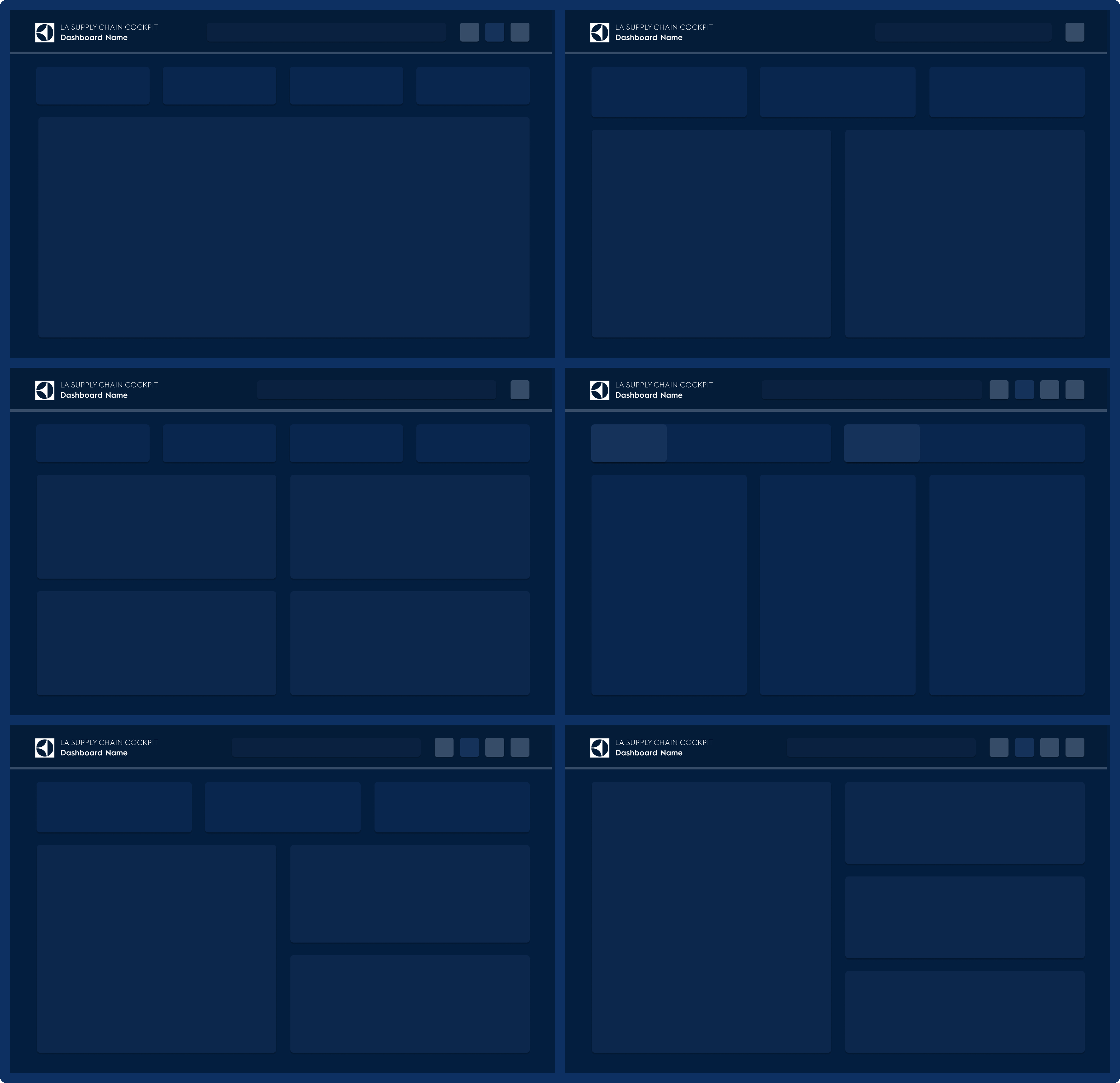
Layout System Component Slots Figma to Power BI
Sample dashboard layout templates from the standard

↑ A sample of the layout templates. Data and content removed under NDA; the structure is the deliverable

Every dashboard shipped with its documentation

Each delivery included a document listing its KPIs, the real data source behind each one, and the reasoning for using it. Anyone reading a number could trace where it came from and why it was there.

And with the means to repeat it

I also built the standard documents and processes for replicating that documentation on any new dashboard, so the practice would survive without me writing each one.

The process · 5 waves across LATAM

The process that repeated five times.

Business Understanding

Every wave started with structured stakeholder meetings to capture the rules behind the numbers: what each metric means, who owns it, what decision it enables, what threshold triggers action. Skipping this produces consistent dashboards that answer the wrong questions.

Stakeholder interviews KPI mapping Business rules

Data Alignment

With the rules captured, I worked with data analysts from Dojo and Electrolux to map what the Data Lake could actually deliver: available fields, required transformations, and gaps between business expectation and data reality. This surfaced quality issues early, before they became rework.

Data Lake review Analyst collaboration Gap analysis

Template Design

Instead of building each dashboard from zero, I designed the template system first: grid, color semantics, typography scale, and component patterns. Each dashboard then applied the template to its context. This was the decision that made the system scalable.

Visual system Component patterns Reusable templates

Build and Validate

Dashboards were built in Power BI, connected to the Data Lake, and validated with business and data teams. Validation went beyond visuals: numbers checked against the phase-one business rules, filters tested, and the view held against the original question the stakeholder brought to the first meeting.

Power BI Data binding Stakeholder validation

Deliverables

What stayed after the engagement ended.

The work produced more than dashboards. It produced a system anyone inside Electrolux could pick up and continue without needing Dojo in the room.

Templates

Reusable Dashboard Templates

Three base templates, one per context, with defined grids, placeholder components, and annotation layers. Any team could adapt one to a new business area without redesigning the visual logic, and without requesting a designer.

Documentation

Visualization Manual

A guide covering color semantics, chart selection by data type, and layout rules per context, with step-by-step replication instructions. Written for a business analyst with basic Power BI skills, no design support required.

Rollout

5-Wave Deployment

Each wave covered a different business area across LATAM. Because design and build followed the established pattern, each wave shipped faster than the last; business understanding became the only real variable.

The outcome

The board made it the global standard.

Five waves, compounding speed

Five deployment waves across LATAM, each covering a different business area. Business understanding was the only variable that reset with each wave: template and build followed the established pattern, so every wave shipped faster than the one before.

One presentation changed the scope

Dojo's engagement was LATAM. When the standard was presented to Electrolux's global board, it was approved as the company-wide pattern for data visualization and extended to the group's operations worldwide.

A system, not just three views

The delivery was the executive, operational, and analytical dashboards, and also the system underneath them: scattered spreadsheets replaced by one true source in the Data Lake, and a standard internal analysts extend on their own, long after the consultancy's exit.

The brief described a deliverable. The real problem was a system. Dashboards without a standard would have answered the request and preserved the fragmentation, so I solved for the standard. That is why the work is still in use.

More work

Multipedidos

Multipedidos

Senior Product Designer at a food platform serving 4M+ orders a month. Design system, consumer product, and AI-assisted workflows.

Product Design · Food Tech

Keepeye

Keepeye

KPI management platform for Dojo Smart Ways. Sole UX Engineer: designed the full product and built production components in Angular.

UX Engineering · B2B SaaS

IncludED

IncludED

Co-founder and Lead Product Designer at PixelPunk. Built a SaaS platform for inclusive education from zero to first paying customers.

Product Design · EdTech SaaS