Case Study
Two products, six teams, and 4,000+ restaurant clients, with one designer in the room. I built the design system and the product design practice while shipping more than 40 features.
Background
The Situation
I joined Multipedidos in January 2024, first as a freelancer through Estudio 149, then as a fixed contractor. I was the company's first and only designer. Screens went from request to production without passing through anyone whose job was to question them.
The product had two surfaces: Gestor de Pedidos, the B2B system restaurants run their operation on, and Pedir.Delivery, the ordering platform their customers use. Both were growing fast, and every release added design debt nobody was tracking.
The Mandate
My job was to make design something the business could depend on: a component system engineering could consume directly, a process that caught problems before production, and eventually, proof that design decisions moved business metrics.
The hard part was the timing: six teams asking for screens at once, and no pause in the delivery rhythm to set up the infrastructure first.
I had to build the foundation under a product that never stopped moving.
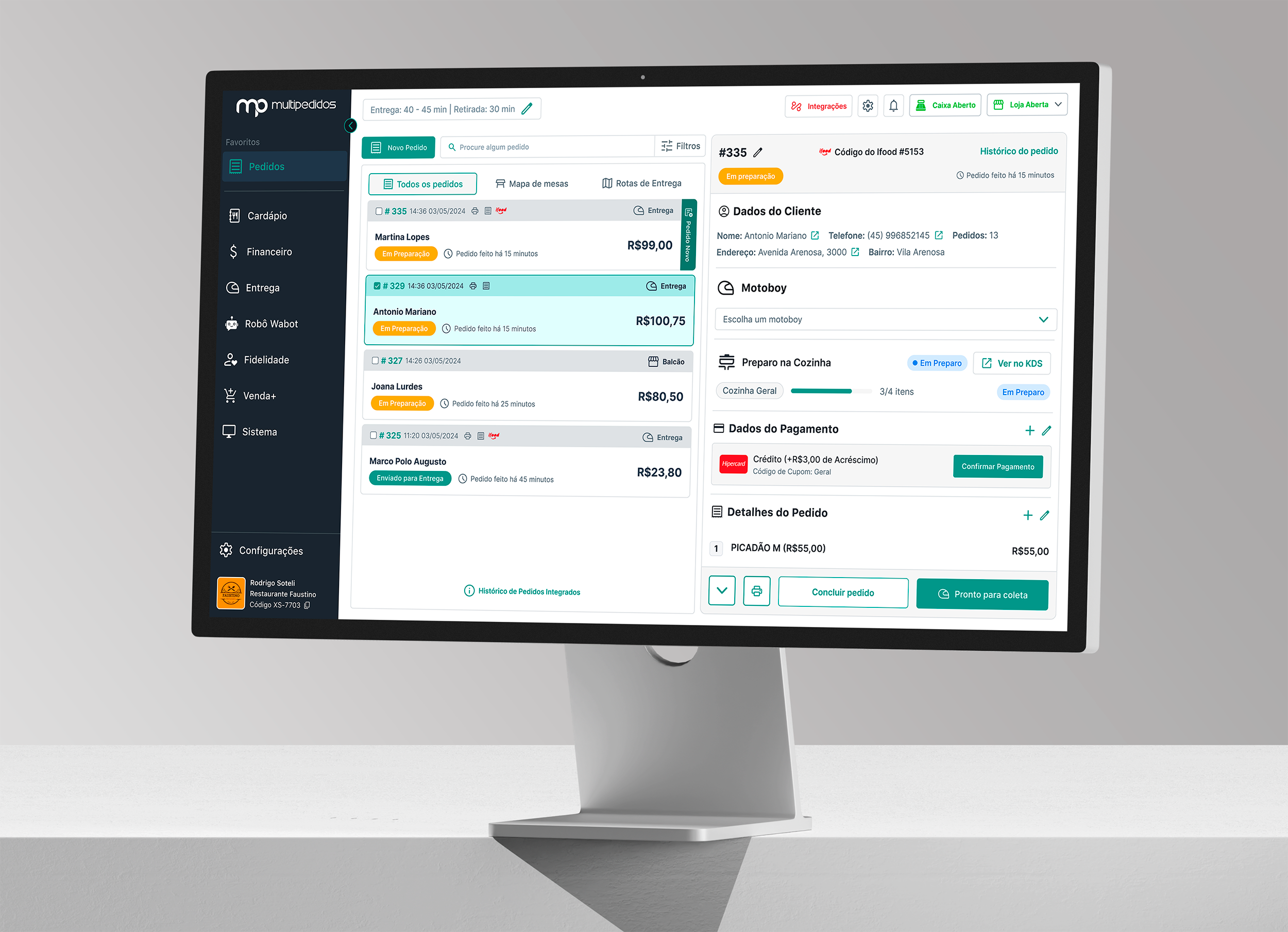
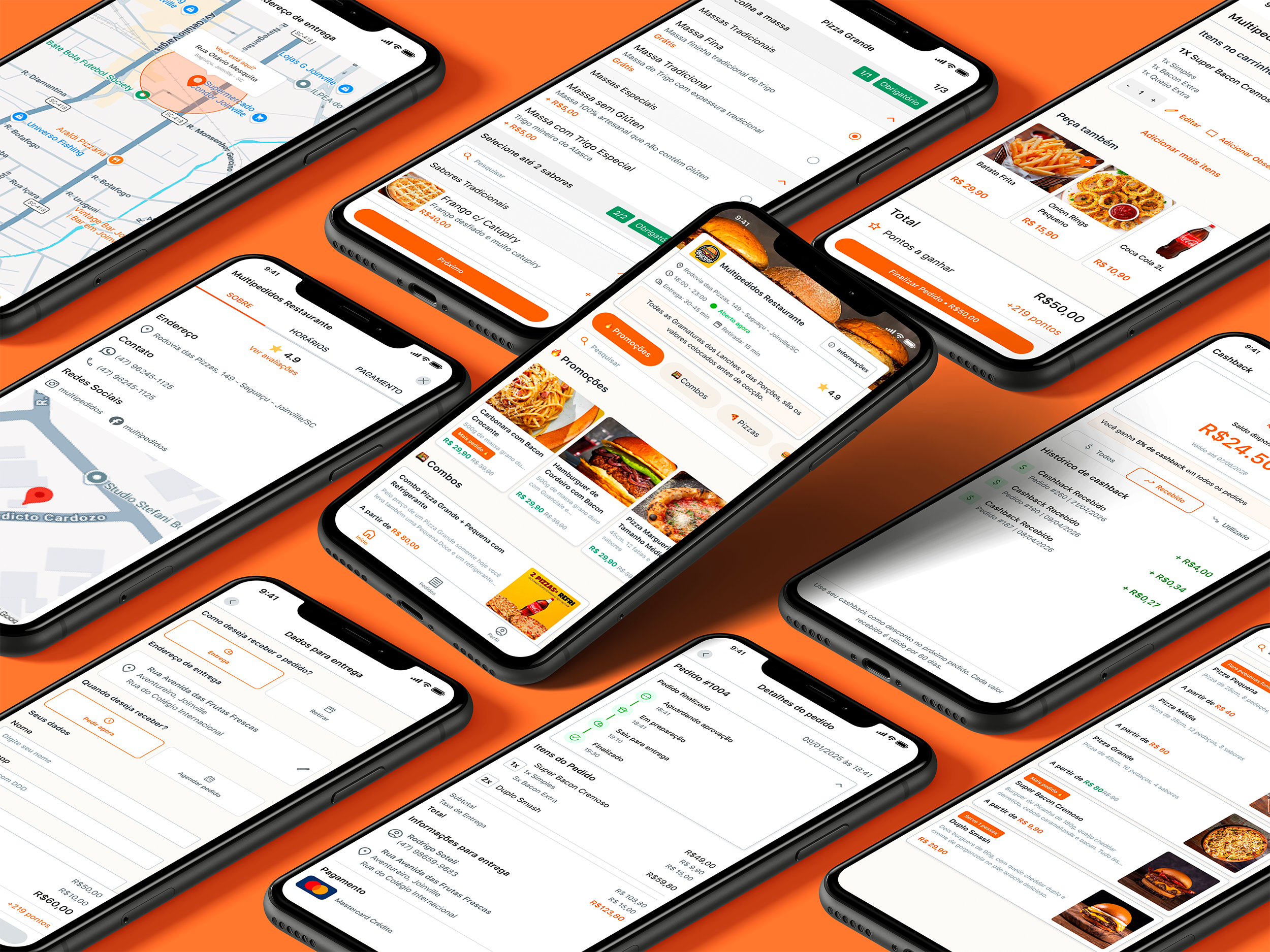
↑ Gestor de Pedidos, the B2B system restaurants run their whole operation on
The foundation
With six teams asking for screens, the tempting move was to just draw them. I started with tokens instead: color, spacing, typography, radius, and elevation. It cost speed in the first weeks and paid it back on every screen since.
A full token layer with dark and light mode from the start. Ant Design gave us the component structure; the tokens gave us the identity. A change at the token level propagates to every screen in both products.
I set up Figma DEV Mode so every component maps to a code reference. Developers inspect the real spec instead of guessing from a flat image. Implementation fidelity improved from the first sprint we ran it.
Pedir.Delivery lives on phones. Gestor runs on desktops and tablets behind a counter. Every component was built for both contexts, which is how the system stretched to 1,000+ screens without forking.
01 · Consumer product
The redesign started with competitor benchmarking and interviews with restaurants from the base: what they expected from an online menu, what they were missing, and which parts of the daily routine hurt.
From there I owned the full funnel, from ordering flows and item viewing to cart, payment, and delivery or pickup. Every decision served one goal: more completed orders, because drop-off doesn't care which screen it happens on.
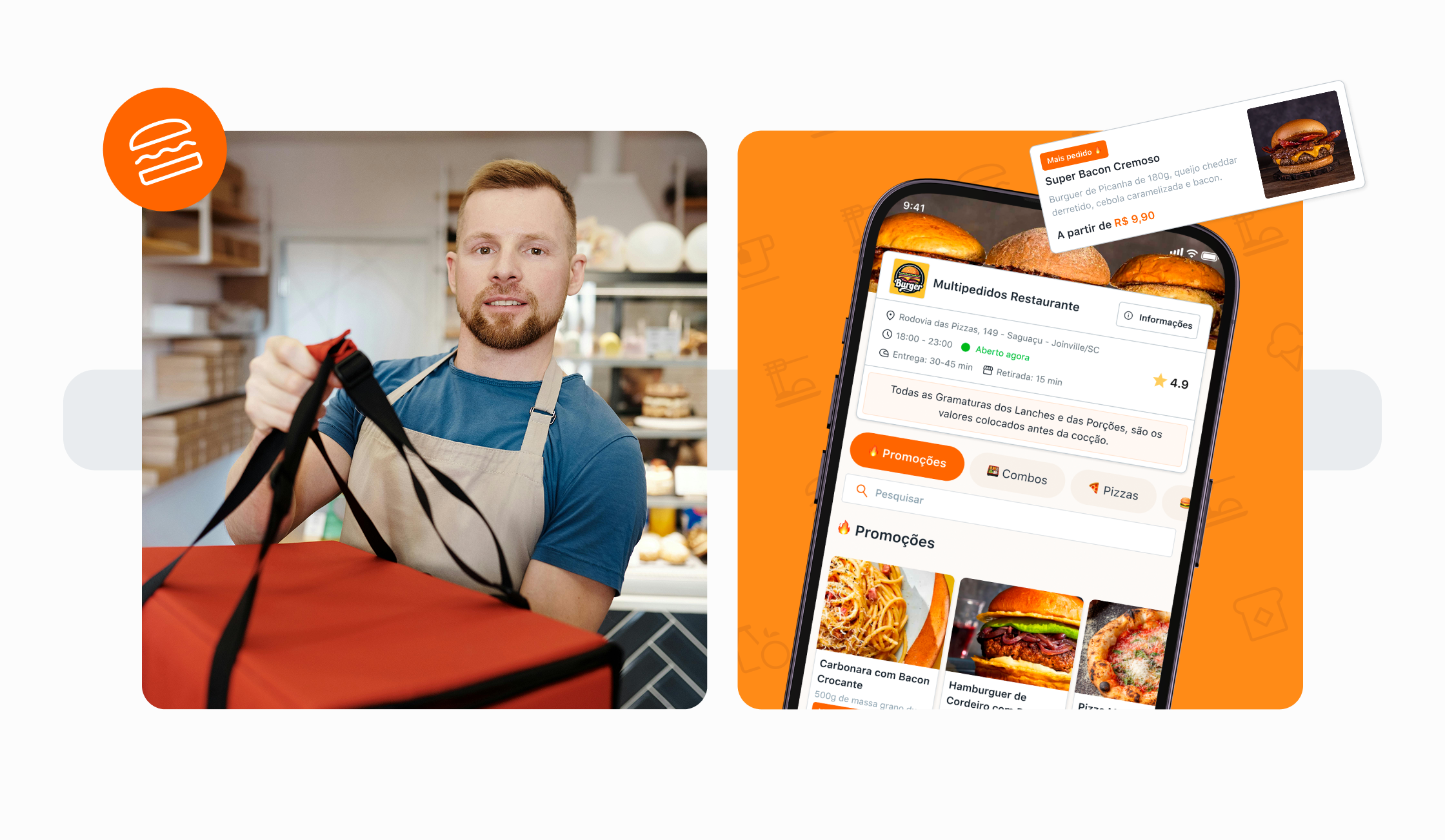
↑ The redesigned consumer experience, rebuilt for the market it competes in
01
Menu
Category browsing, item cards, search, restaurant info
02
Item Selection
Generic items, pizza builder, combo selection, modifiers
03
Cart
Review, quantity edit, loyalty points preview, CTA
04
Checkout
Delivery details, payment method, cashback, coupons
05
Confirmation
Order confirmed, delivery ETA, async payment tracking
Three Ordering Flows in One
The menu has three structurally different item types. A generic item needs simple modifiers. A pizza needs size, crust, toppings, and half-and-half validation. A combo walks through group slots, each with its own options. Three data models that had to feel like one product.
Reducing Abandonment at Every Step
I redesigned the flow with drop-off as the explicit brief. Loyalty points appear in the cart, before checkout, so customers see what they earn before committing. Customization shows mandatory choices first and hides the rest. Cart to checkout is one tap, with the price confirmed inline.
Login, Account and Loyalty System
I also owned login, account creation, password recovery, and the loyalty interface: point balance, redemption rules, and earnings surfaced throughout the ordering flow. A visible reward is a reason to finish the order.
01 · Consumer product · Transactions
Checkout is where the order either completes or dies. I owned the whole transactional layer: six payment methods across two contexts, cashback, coupons, three delivery modes, and A/B tests running on the live flow.
Cart
Review
Delivery
Details
Payment
Selection
Discounts
& Cashback
Order
Confirmed
Payment
Tracking
Pay Online
Pay on Delivery
The cashback balance sits at the top of checkout: total, available amount, expiry, one tap to apply. Coupons live in the same group, so discount decisions happen together, before payment.
Address for delivery, table for dine-in, car identification for curbside. Each context needs different fields and confirmation states, and all three had to fit one checkout structure instead of becoming three flows.
Pix and Mercado Pago create an intermediate state: order confirmed, payment pending. Three screens handle Pix QR, Automated Pix, and Mercado Pago. A/B tests on the confirmation layout ran directly on live checkout.
↑ Pedir.Delivery in use: browsing, item customization, cart, and checkout
02 · B2B platform
Gestor de Pedidos is the system restaurant owners and staff use to receive orders, manage menus, charge at the counter, and close the day. Most of its flows had never been touched by a designer, so every redesign started from observing how restaurants actually operate.
The scope ran from core infrastructure (menu builder, KDS, navigation) to payments (POS, multiple payers, PIX, wallet, cashback) to operational tooling (print queue, reports, integrations) to growth (CRM, onboarding agent). Every structural change shipped in stages, because a mistake at the base would hit 4,000+ live restaurants at once.
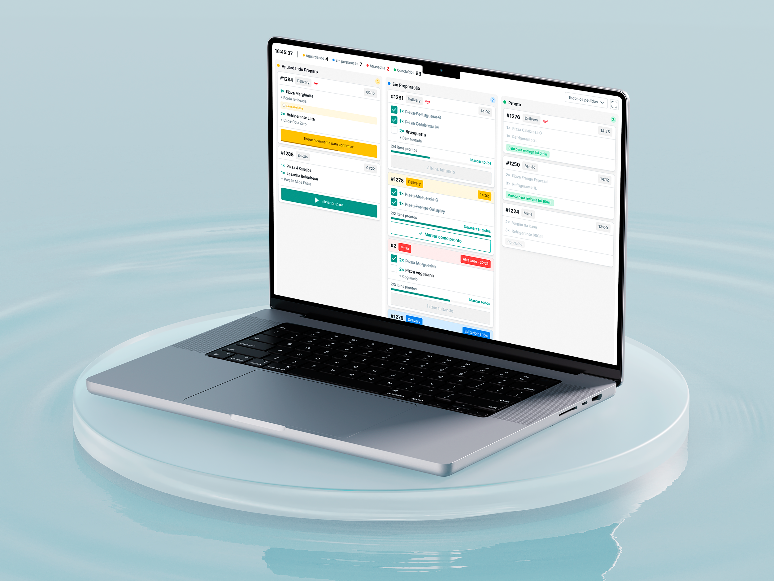
↑ Gestor de Pedidos: order reception, menu, POS, and the daily close in one system
Selected Deliveries
Kitchen Operations
KDS Implementation
A real-time order display for kitchen stations, replacing printed tickets: order states, item grouping, timing indicators, multi-station routing. Kitchens are loud and hands are dirty, so everything had to be readable at a glance and hard to get wrong.
Point of Sale
POS Redesign
Customer selection, product lookup, order building, and payment routing, rebuilt. The new flow handles split payments across multiple payers and gives Pix Automatico a native approval state, so nobody wonders whether a payment went through.
New Feature
Multiple Payers
One order, several payers, each with their own payment method. I designed the split calculation, the individual confirmation states, and the pending state for when part of the table has paid and part hasn't.
Payment Integration
PIX + Digital Wallet
The in-store PIX flow end to end: QR generation, status polling, confirmation, failure recovery. The Digital Wallet gives restaurants one place to manage incoming PIX transfers processed by partners like Asaas.
Navigation
Sidebar + Information Architecture
Pages had been added in shipping order, not in any order that made sense to an operator. I audited the feature set, mapped how each role moves through the system, and rebuilt the navigation around that. A new Favorites feature lets each operator pin the pages their operation actually uses.
Deep dive · New menu builder
The most requested fix in Gestor was also the most structural one. Creating a menu item required every dependency to already exist: to build a chicken pizza, the operator left the pizza flow, created the chicken flavor, came back, and started over. I ran the full product cycle on the new version: discovery, usability tests with users on the first release, Design Critiques with the internal teams, prototyping, and development, rebuilding the flow around one principle: nothing you are missing should throw you out of what you are doing. While the new menu took shape, I orchestrated the migration strategy in parallel, so the rollout was ready the day the product was.
Before: forced exits
After: in-context creation
The practice
Weekly critiques with developers, QA, CX, commercial, and directors. Anyone with a stake in the product could question a flow before it shipped, not after.
Real restaurant operators tested flows before release. Findings shaped iterations instead of post-mortems.
A/B tests on Pedir.Delivery connected design decisions to conversion numbers, which made quality easier to defend in roadmap discussions.
Claude connected to Figma via MCP generates specs straight from the design tokens in the file. Handoff went from 5 days to 2.
I built independent product-discovery and technical-discovery processes, with their own documentation, for the six teams under my responsibility, and wired both into the agile routine. Pre-development time dropped 30% and rework fell by more than 80%.
Technical management of the multidisciplinary squads connected to product projects: activities, metrics tracking, OKRs, documentation, and supporting diagrams and flows. I also onboarded new Product hires and joined the area's technical interviews.
60%
Prototype and handoff delivery used to take five working days: design the screens, document interactions, write specs per component, align with the devs, revise.
I connected Claude to the Figma file through MCP. Component specs, interaction descriptions, and dev-ready documentation now come straight from the tokens in the file. Five days became two, and the recovered time goes into research and iteration.
Results
The highest-leverage work at Multipedidos was never a single screen. It was the token system, the critique ritual, and the handoff pipeline: the infrastructure that let one designer keep the software behind 4,000+ restaurants coherent.
More work
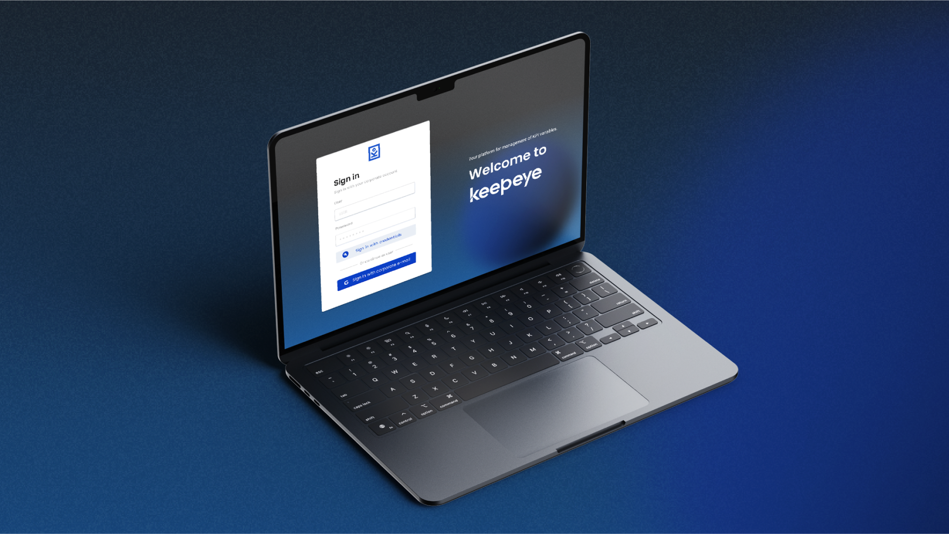
Keepeye
KPI management platform for Dojo Smart Ways. Sole UX Engineer: designed the full product and built production components in Angular.
IncludED
Co-founder and Lead Product Designer at PixelPunk. Built a SaaS platform for inclusive education from zero to first paying customers.
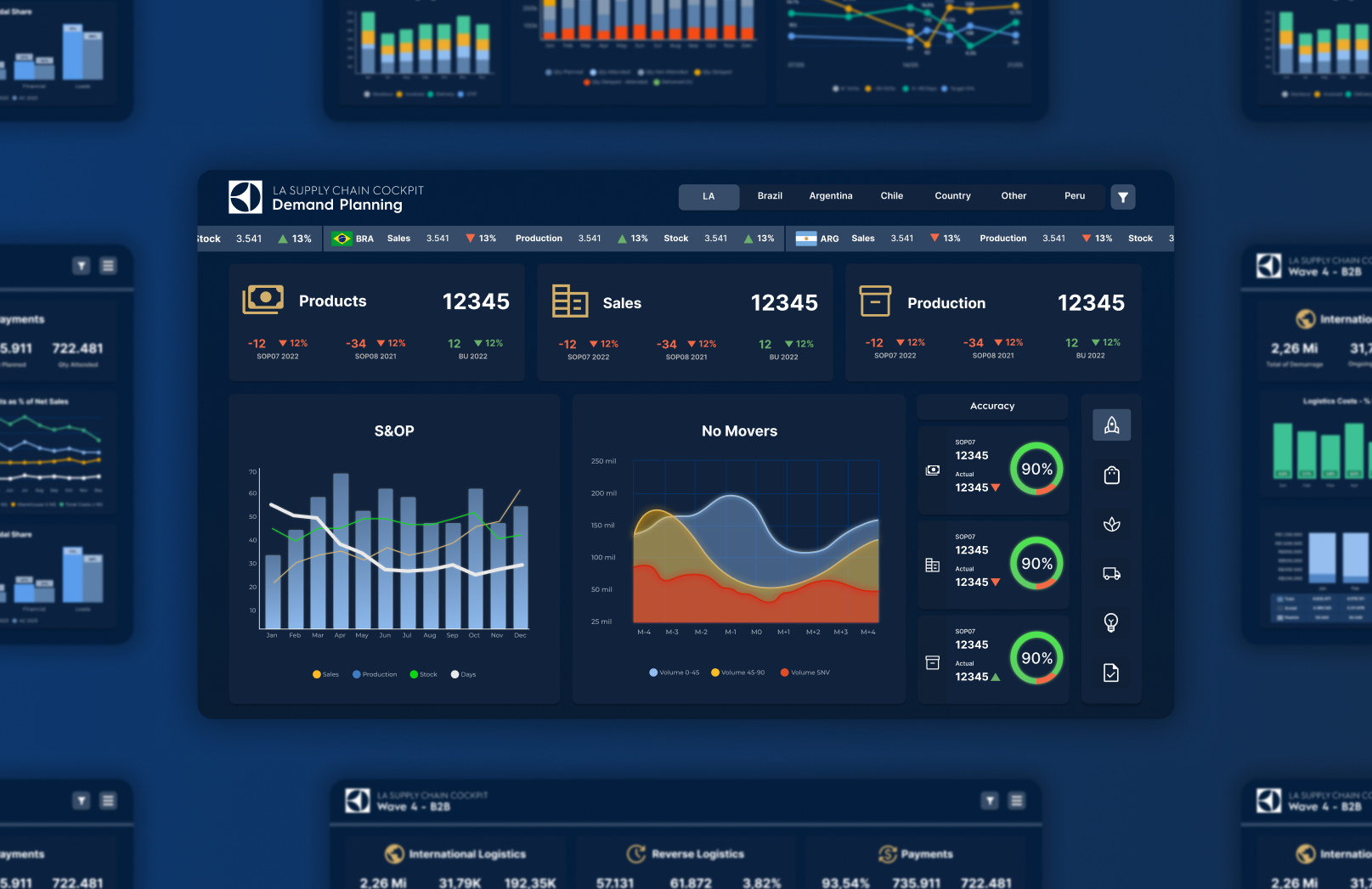
Electrolux
Dashboard visual identity and design system for global markets, via Dojo Smart Ways.